1.
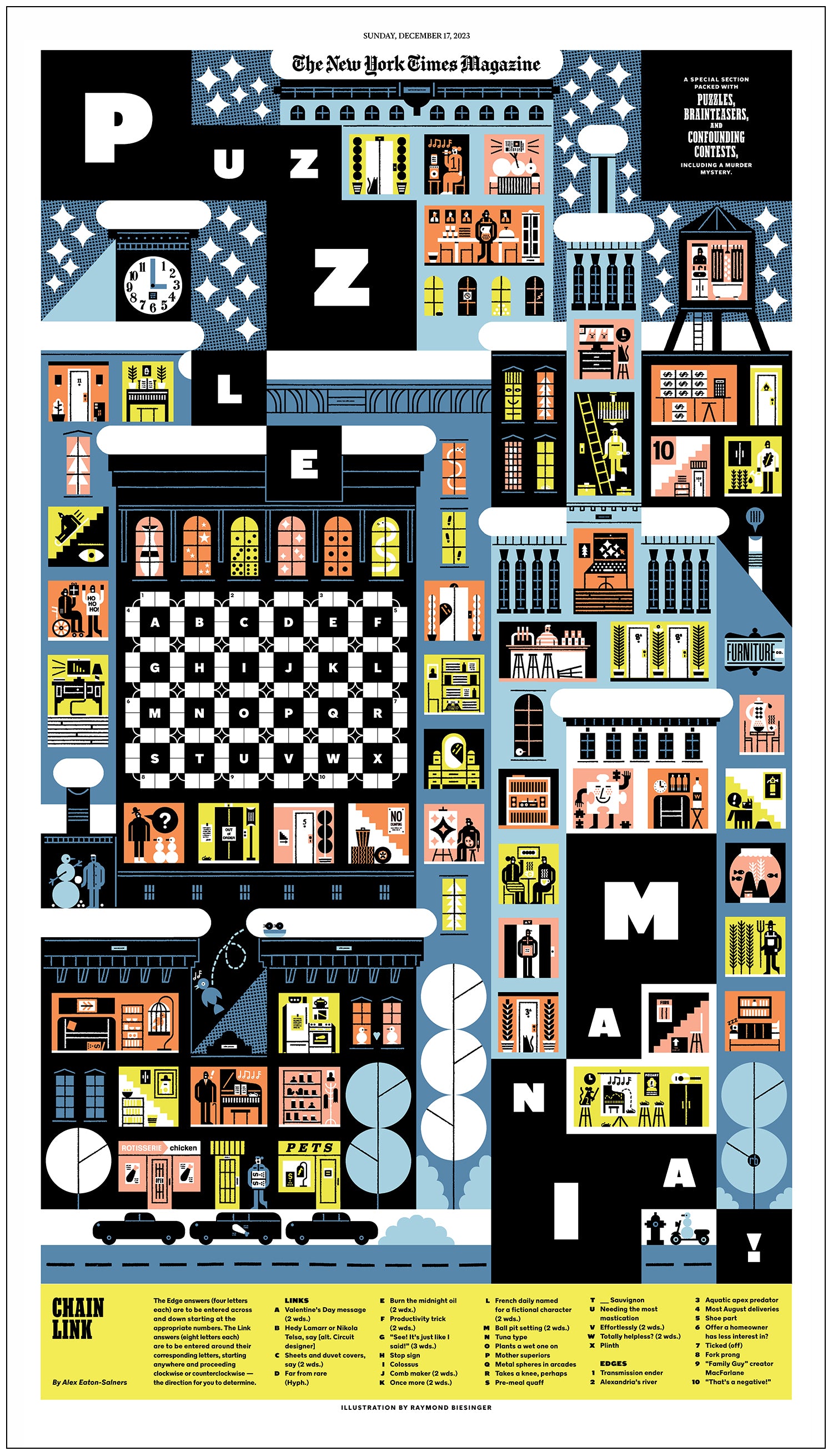
I made this back-breakingly complex cover, a puzzling spread, and a bunch of sprinkles for the 17 December 2023 New York Times "Puzzlemania!" section, and the experience changed what I think is possible with word gamery. I fully consider myself a Word Wizard Apprentice now. Thank you, Fe Didini, for making it happen. You are an absolute champion.
2.
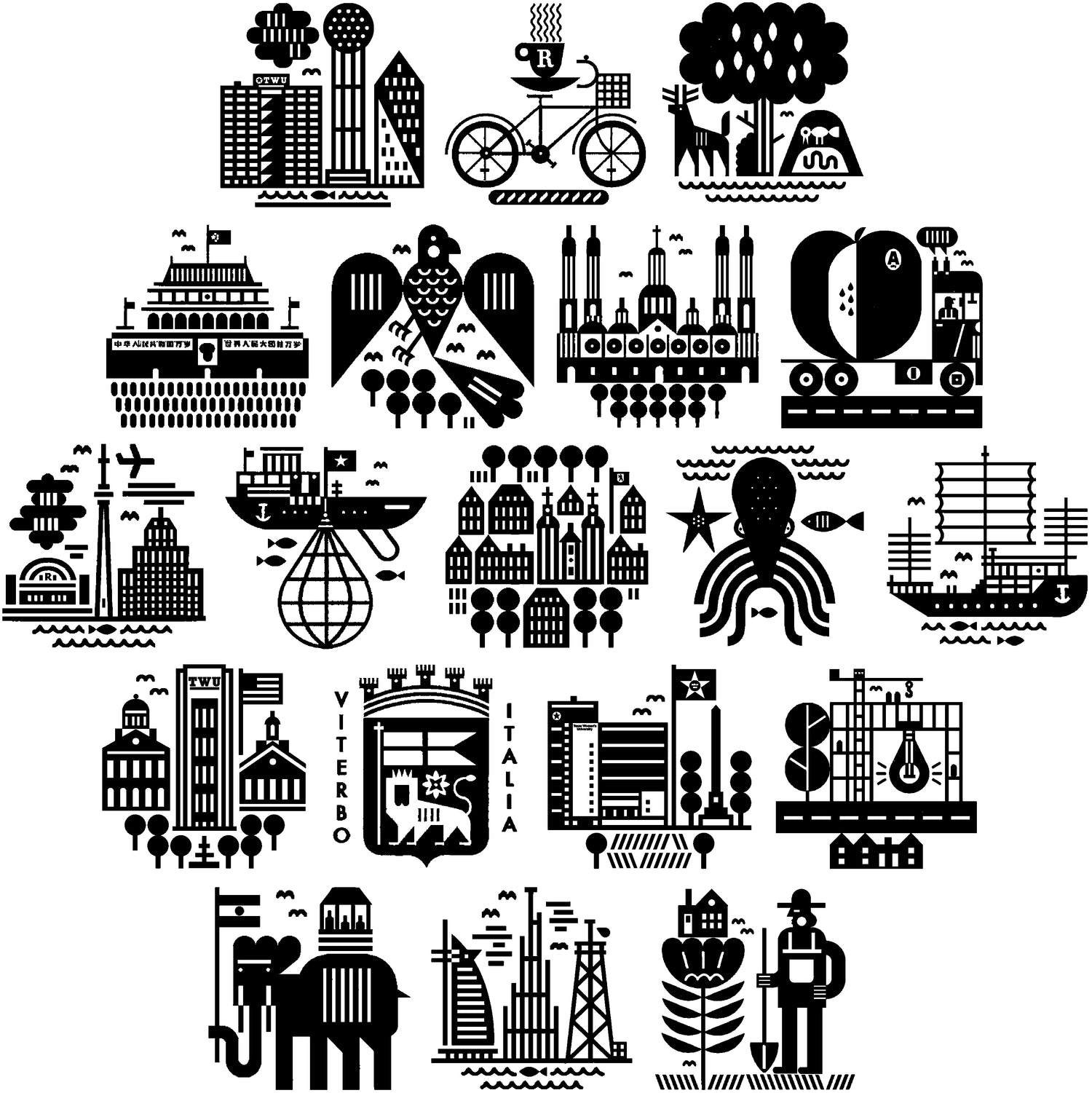
This collection of my 1” B&W icons spans four assignments and a decade and a half. A few were for the American schooling network School Year Abroad’s recruitment brochure, another few for the Rotman School, another couple for the Texas Woman’s University mag, another few for American business magazine Inc. Most are about places, some are about the environment, all were a joy to make.
3.
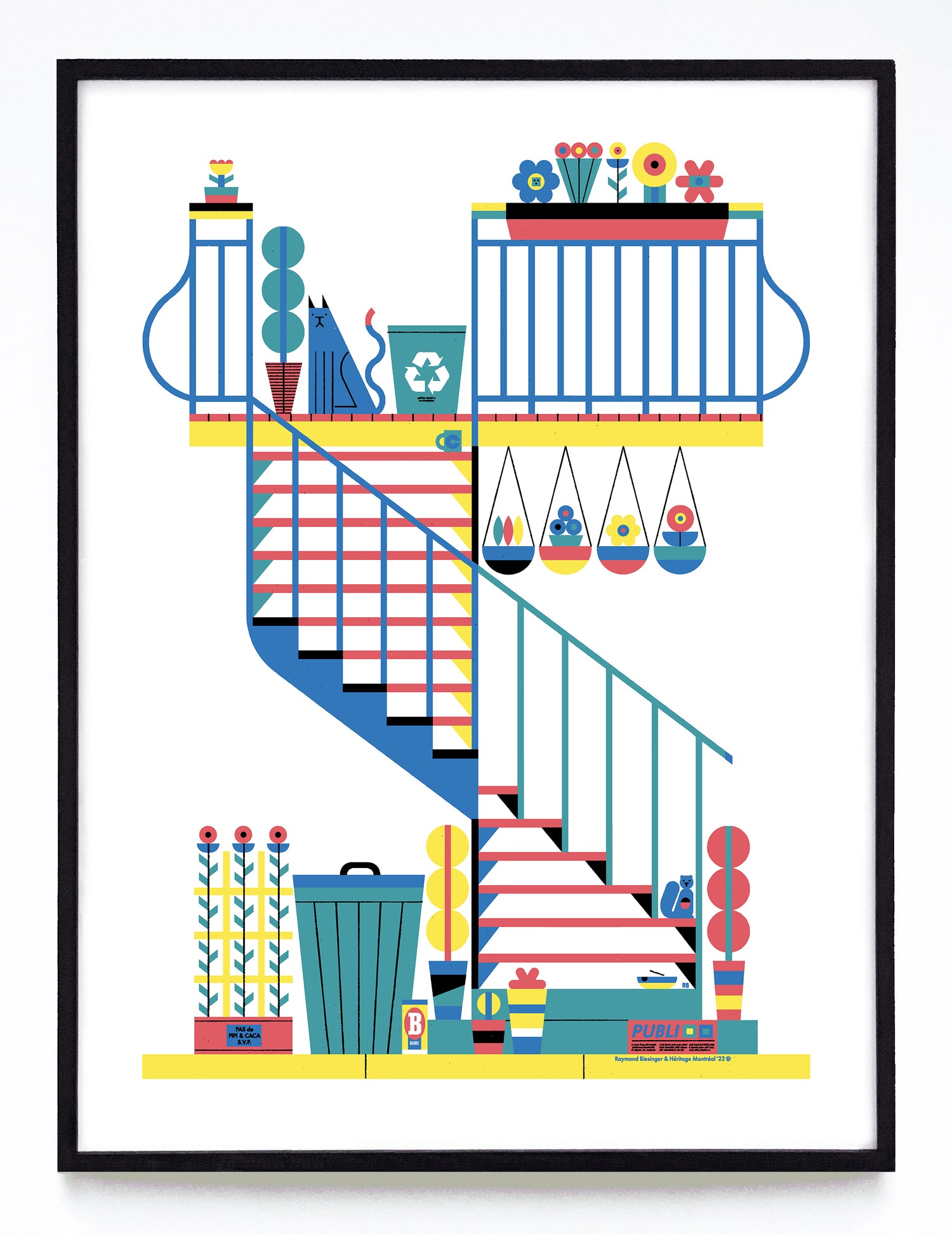
Every year Héritage Montréal takes a short break from defending the city’s built environment and looks through their directory of Montréal artists to make a fundraising print with. This is my 12x16” response to their call in 2022. We chose to focus on the city’s signature external staircases and wrought-iron balconies, complete with stray cats, ashtrays, recycling bins, trash cans, beer cans, plants and the omnipresent stray Publisacs. All of these things I’ve seen (and smelled, and pet) in my decade-plus Montréal life.
4.
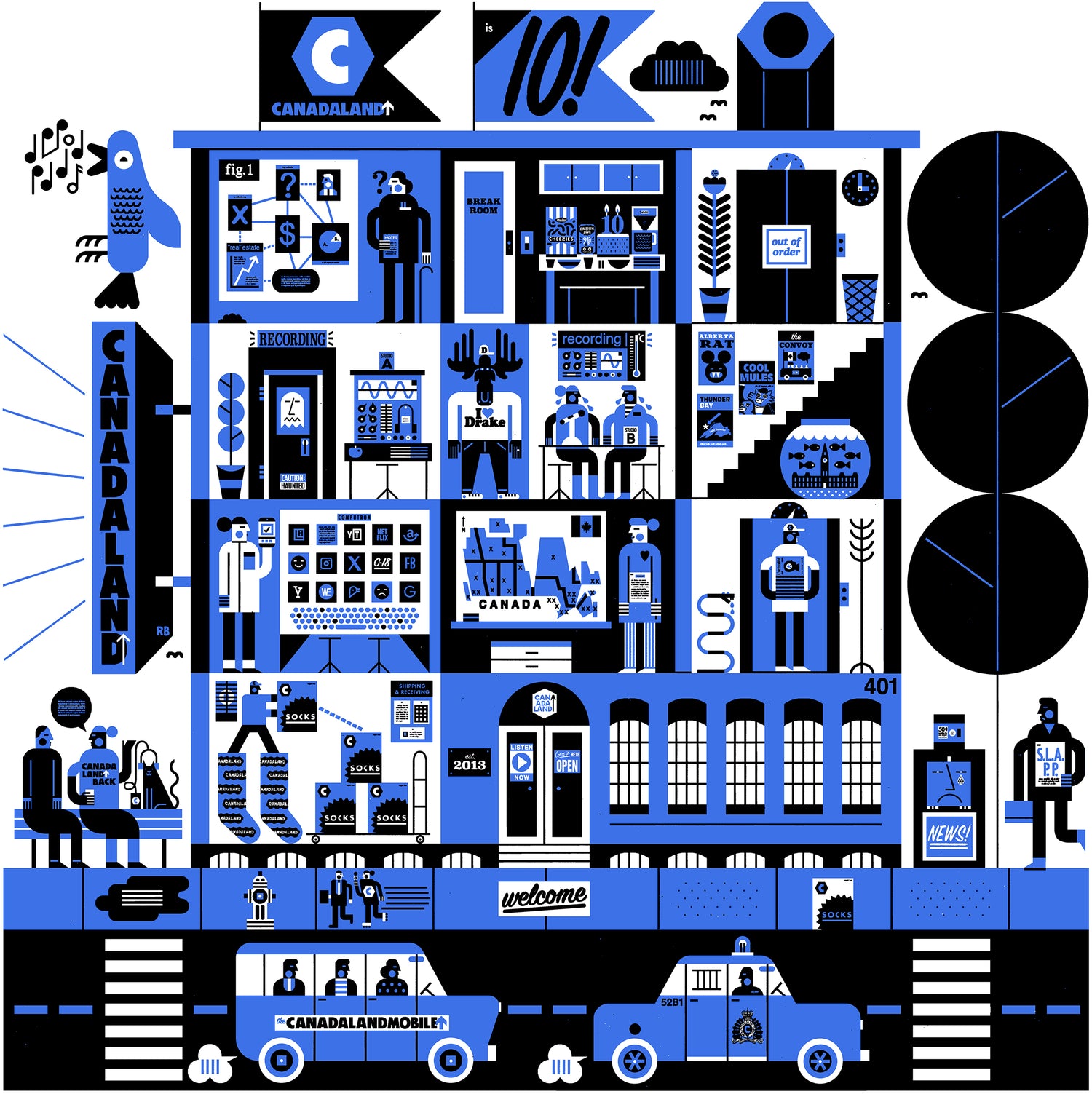
Long before the podcast boom (and even longer before the podcast bust) Canadaland figured out how to make things work out in a way that's neither boring, stable, or bankrupt. They're mandatory listening in the studio (re: Canadian media crit and current events), union-made, and when they asked me to do their 10th birthday and fund-drive art I said "yes." Here we have their 401 Richmond Street headquarters in Toronto, along with all its ghosts, snacks, socks, journalists and snakes. Was deployed online, shirts, hoodies, prints, etc. Art Direction by the excellent Jessica Vallentin.
5.
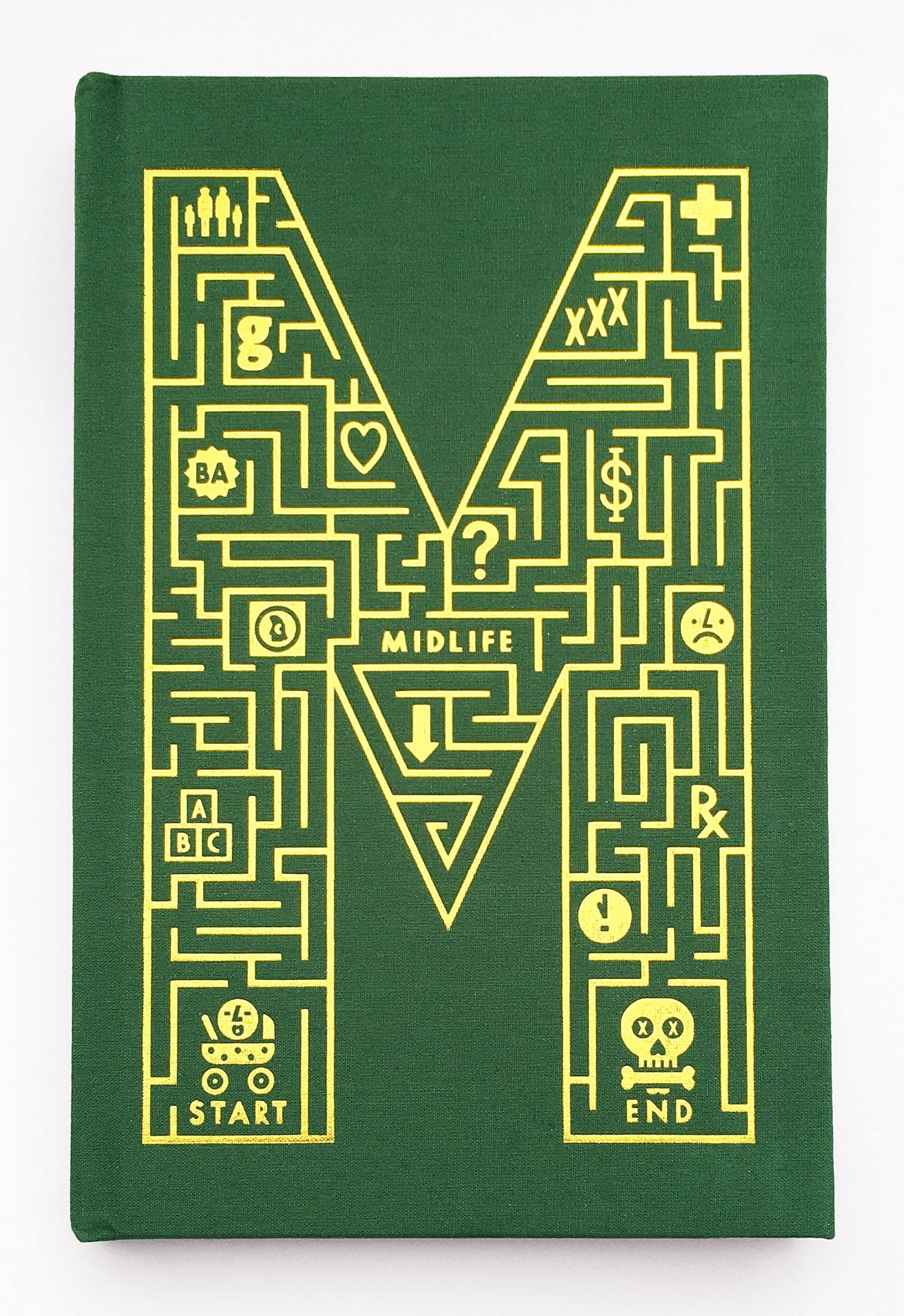
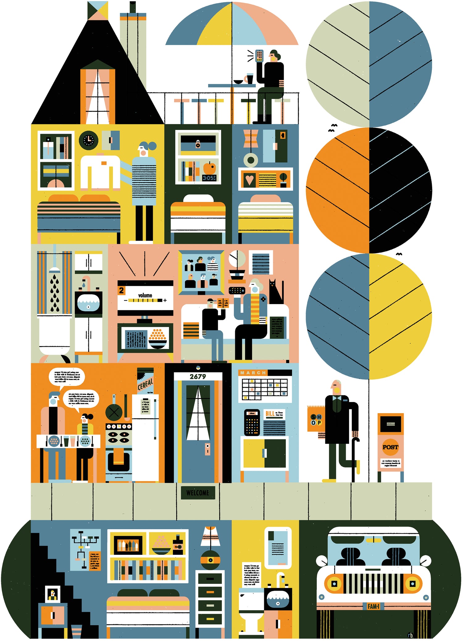
If you're like me, you're just over 40 and realizing there isn't a guidebook to midlife. Well, Midlife books one and two fixed that in 2021 and 2023. They're both clothbound limited edition hardcovers wrapped in gold and silver foil illustrations by yours truly. The first shows a pictorial maze of the contributors' life quests, with the title itself at the path's exact centre. The second shows the worst-case scenario banality of midlife, and it's fully visible right here. Enjoy!
6.
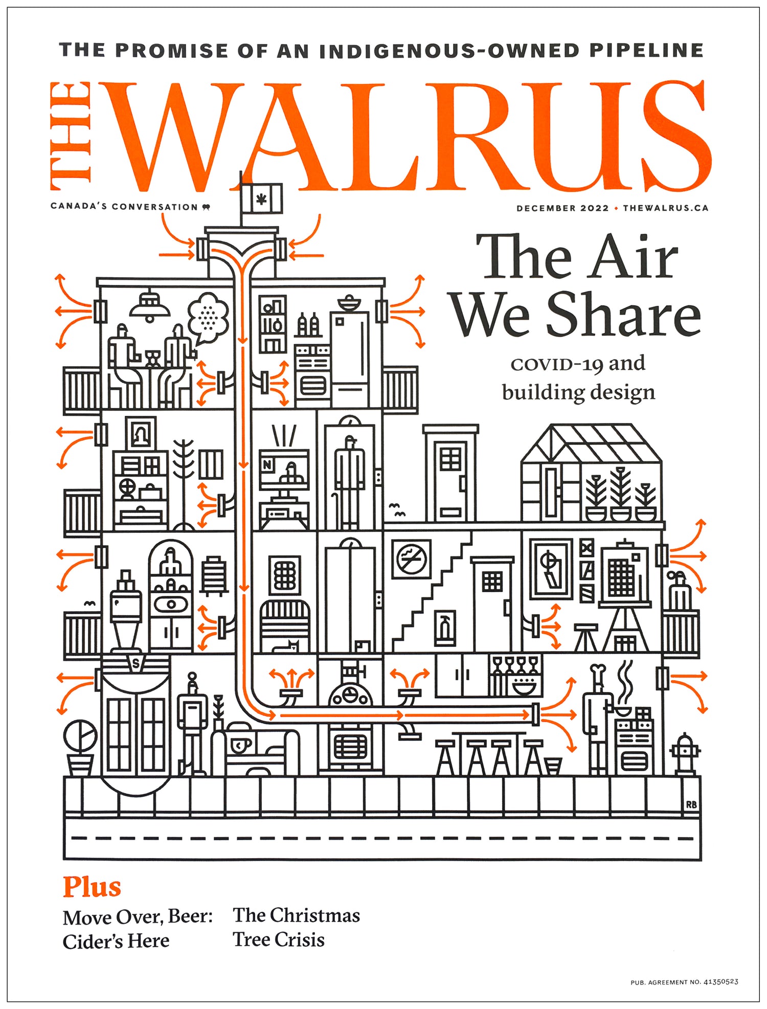
Covers are a challenge. Not necessarily because the illustration needs to dodge or integrate text, not necessarily because of the traditional cover demands for bright colours and easy reads, but because the number of chefs involved; every piece of a publication wants in on the (many) aesthetic decisions that go into a cover. In this case, Walrus DD Paul Kim and I successfully navigated that entire artistic-social-political-managerial structure and made a cover that works with my current fave approaches and interests. That’s a rare thing and a delightful happening. Read the whole piece (and spy some interior illustrations) right here.
7.
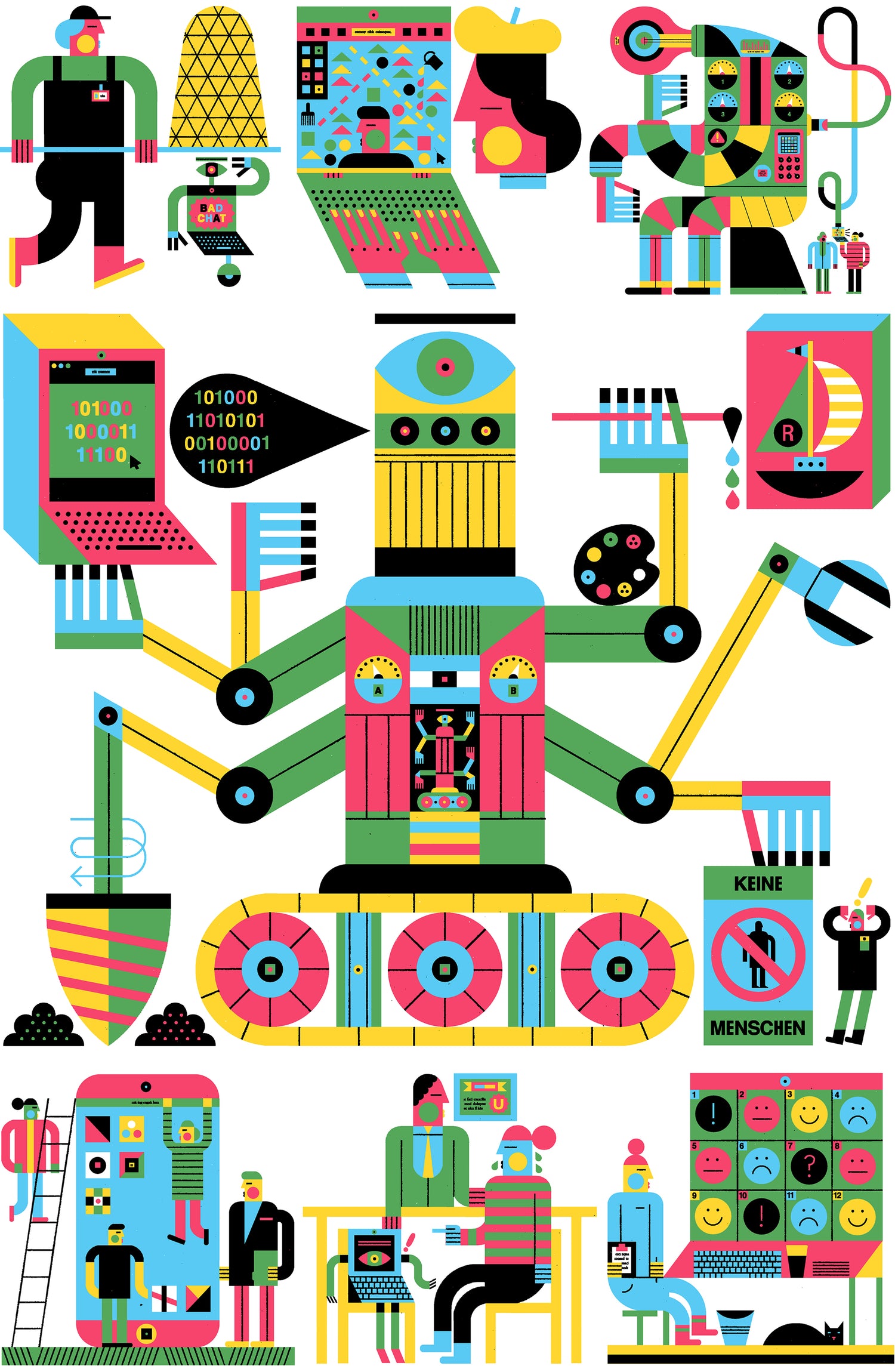
Sci-fi thinkers have long explored the ups and (primarily) downs of technology and labour, and in the September 2021 issue of GQ Deutschland ADs Anais Huettenbrink and Jana Meier-Roberts had me accompany a feature about tech and work and people, and what they might look like in the future. Chatbot wranglers? Zoom background artists? Programming AI? Getting replaced? AI-human mediators that look a lot like couples counsellors? It’s all in there, along with a few others.
8.
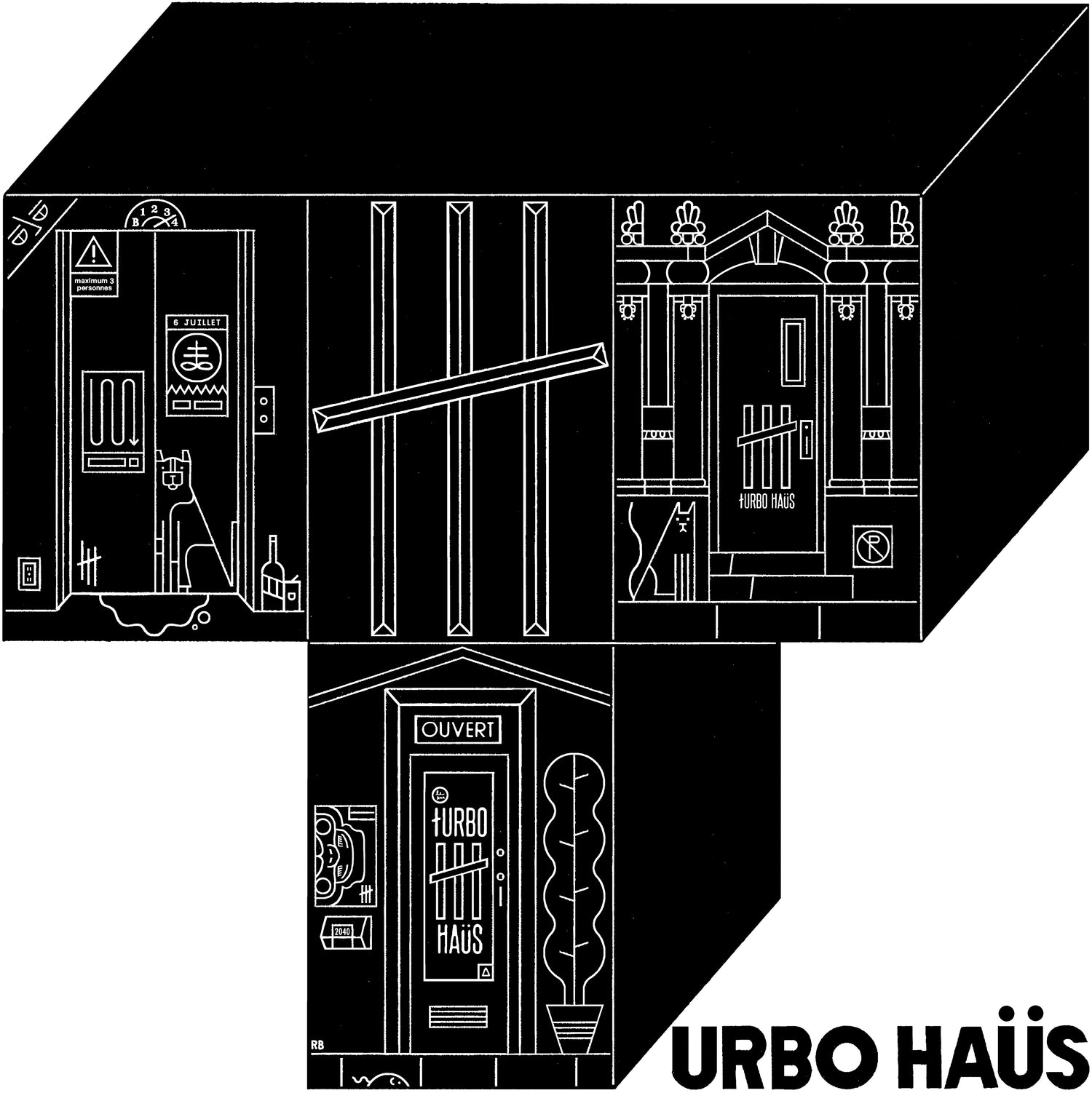
Our friends and neighbours working in hospitality had it especially hard in 2020-2021, and Turbo Haüs is a Montréal venue and club that helped make their ends meet by cranking up their merch game. This one-colour beauty I made for them shows the three different locations Turbo Haüs has occupied since opening a decade ago, and saw service as a tote and long sleeve tee.
9.
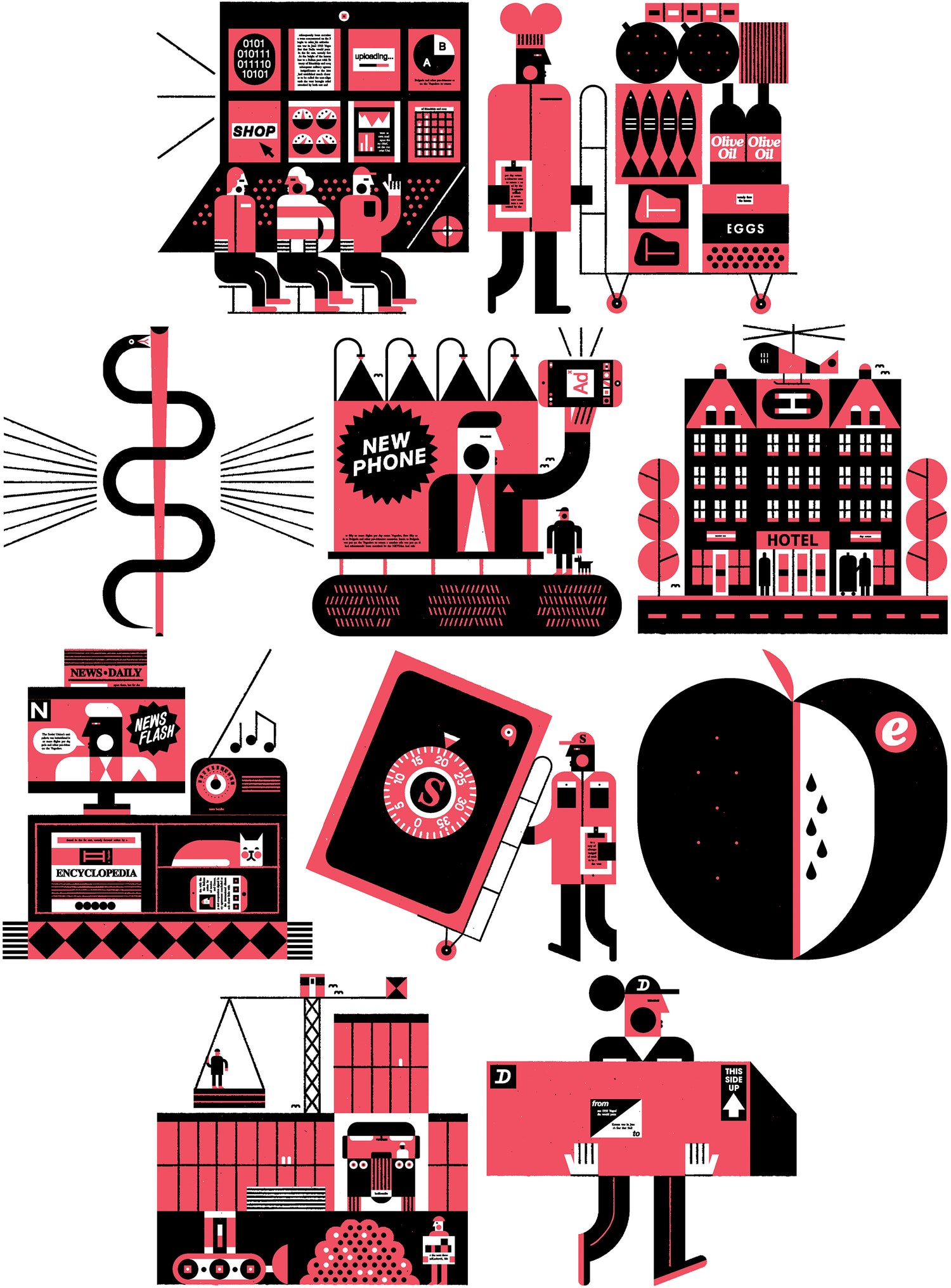
If I could choose one kind of assignment to do for the rest of my life, it’d be long series of small two-colour spots on related subjects. These are prime examples of that: a series of ten 2.5” illustration for frequent collaborator Richard Baker at Inc. for their Sept. 2021 issue. Each heads a different category of business analysis. From top left to bottom right: IT services, food & beverage, health, advertising & marketing, travel & hospitality, media, security, education, construction, and logistics & transport. I submitted finals in three different colours, giving Richard ample choice to mix and match (or not). I’m not even sure which colours they went to print with, but that’s OK.
10.
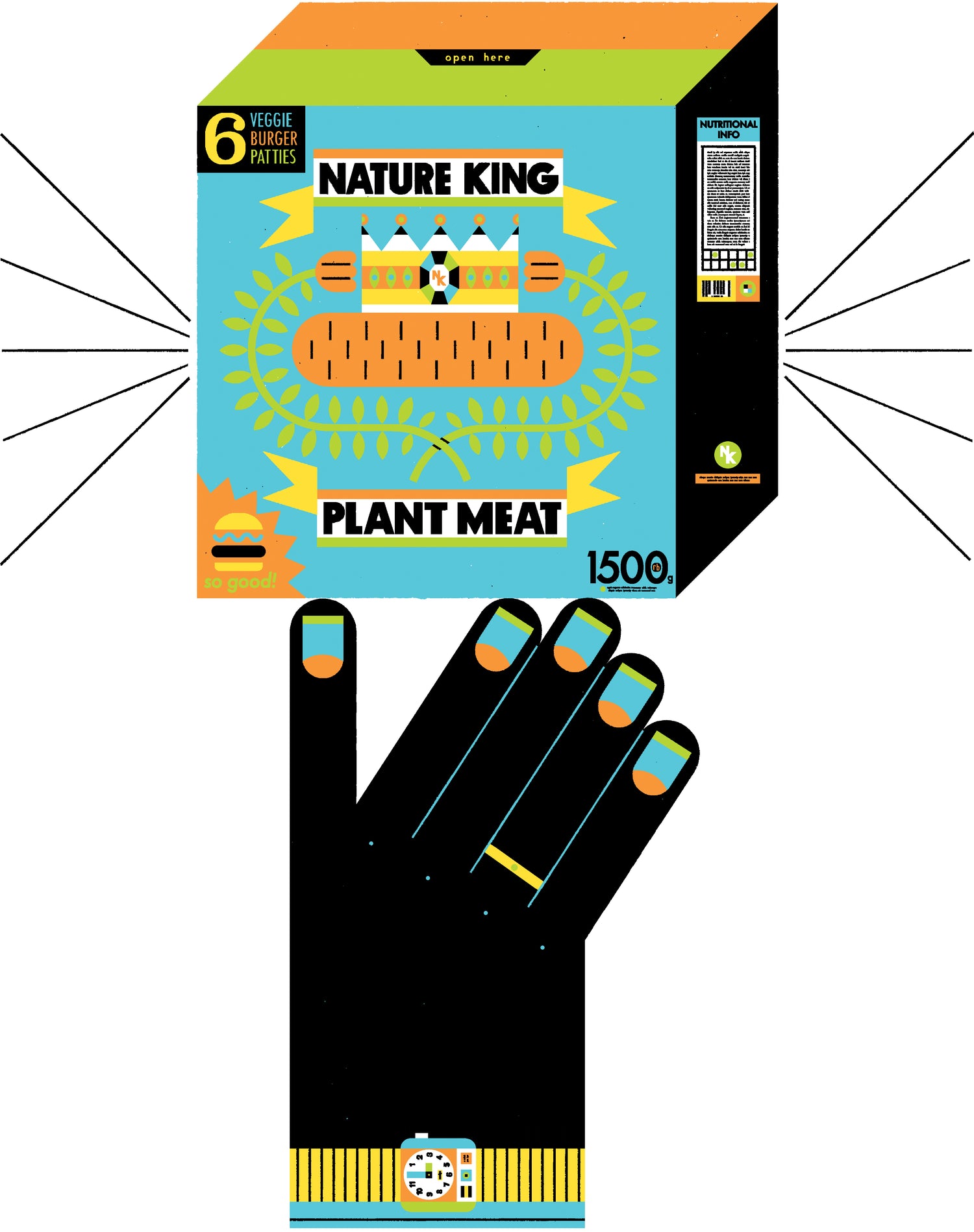
Here I am doling out large amounts of bright colour in the Dec. 2020 issue of Eating Well, on the subject of plant-based meats. Of note: I love drawing packaging that straddles dimensions, and I’ve been a vegetarian since '99. Art direction by James Van Fleteren.
11.
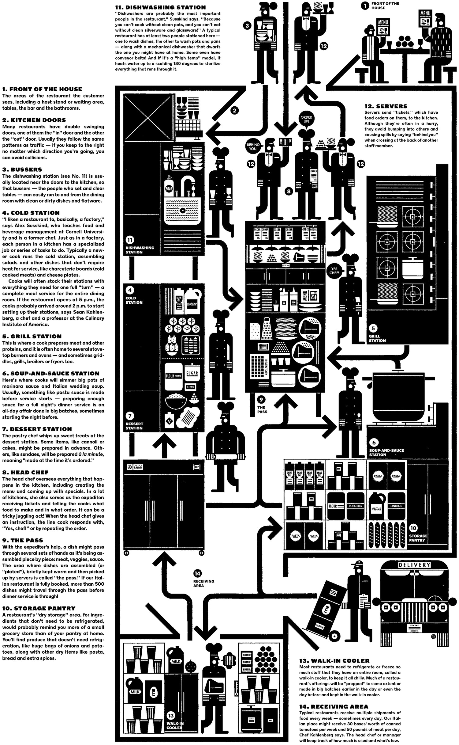
I almost forgot to show you this: a full-page illustrated infographic in the 29 Nov. 2020 New York Times for Kids, showing how a restaurant's kitchen works with accompanying text by Amber Williams. Hands up if you've done serious time in the dish pit.
12.
A full-page colour explosion for AD Emily Vezer in the July 2020 issue of Canadian magazine Today’s Parent, this one on multigenerational living arrangements. It was twice bumped; once when COVID-19 straight-up cancelled an issue, and then again when a more pressing feature took its place. Glad it eventually saw print.
13.
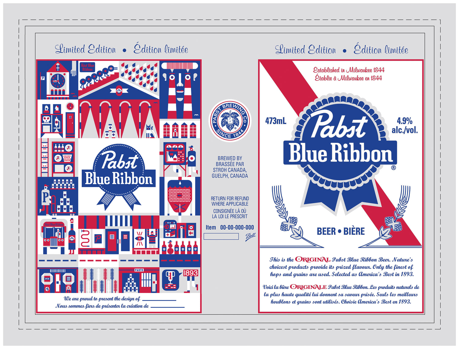
Here I illustrated a strange-world version of PBR’s original Milwaukee brewery, commissioned by Dylan at Leeftail Co. He gave it a thumbs-up, sent it on to Pabst Canada, and 500000 cans of it were distributed nationally.
14.
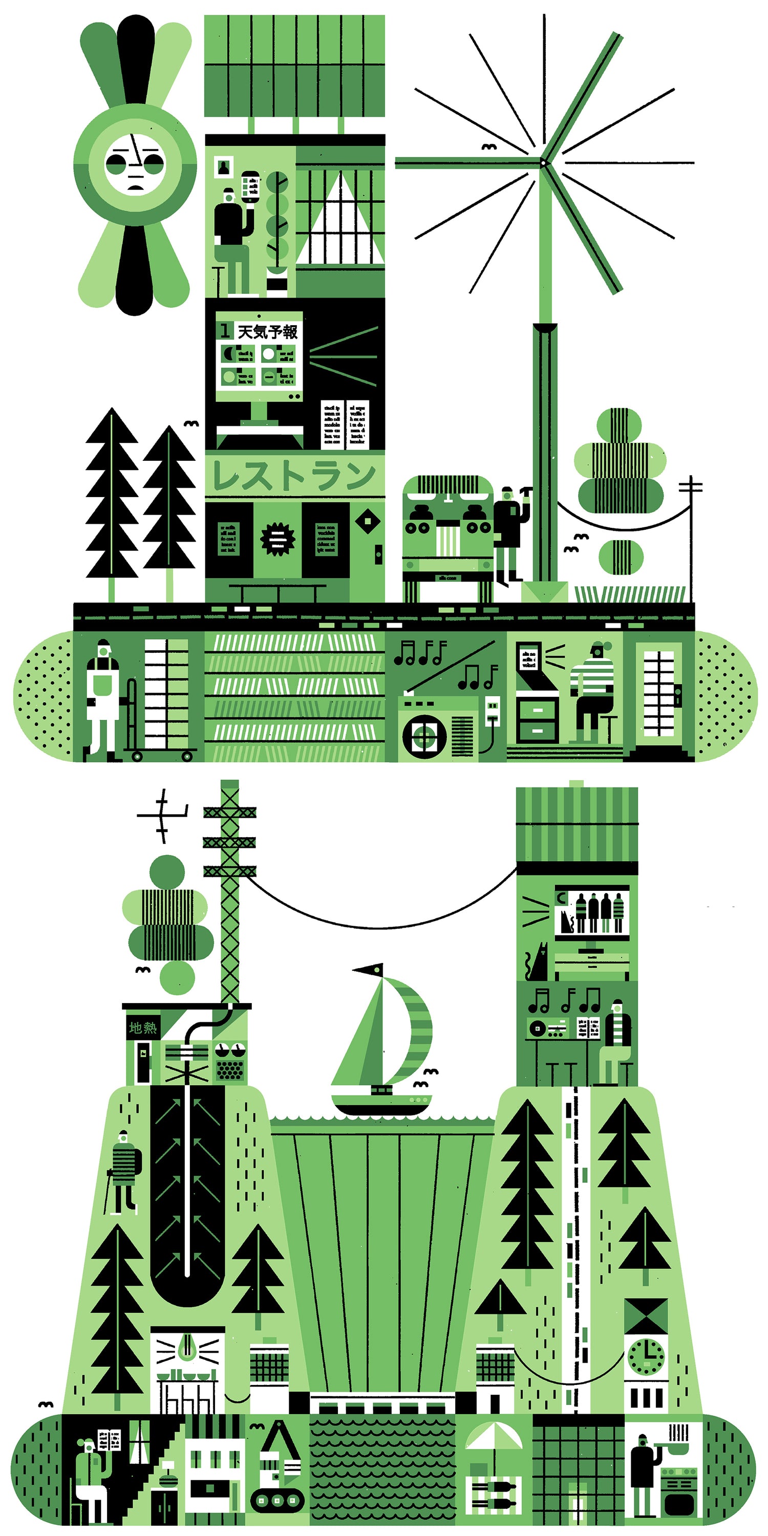
Here are two of five full-pagers for Wired Japan's 36th volume, illustrating a feature on Japan's energy options, pros and cons. We're talking wind, solar, geothermal, hydroelectric, carbon, nuclear, and wood. I’d show you them all, but it’s the magazine’s policy that I do not. Art direction by Erina Anscomb and Takafumi Yano.
15.
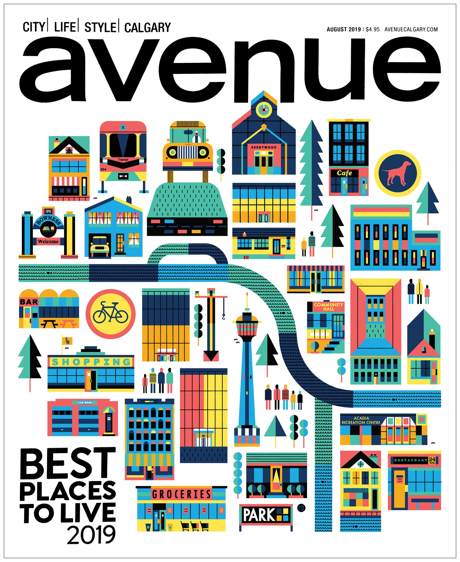
This Silver Alberta Magazine Award-winning cover includes more than a dozen specific visual references to Calgary's “best” neighbourhoods and landmarks, complex colour scheme (for me, at least), and local knowledge from Avenue staff and Senior AD Venessa Brewer.
16.
While I can't tell you why these three buddies were made, I can tell you the project went in another direction (without them) and the Cincinnati-based design studio Holotype was behind them via agency partner and longtime collaborator Dale Doyle.
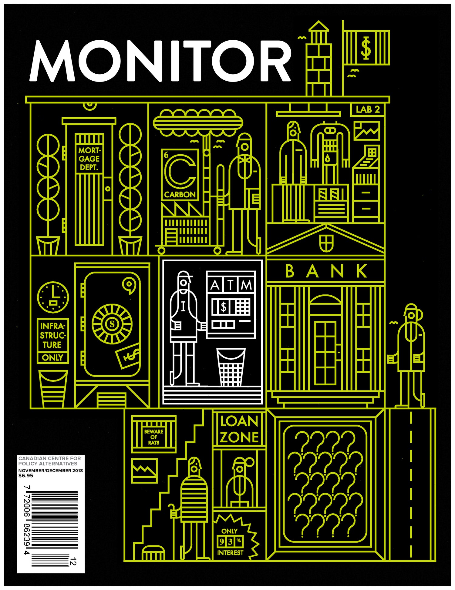
17.
In “celebration” of the 10th anniversary of the 2008 financial crisis, the Canadian Centre for Policy Alternatives’ in-house mag decided to head to the banks, see what’s inside them (re: retail, mortgage, and investment banking), and try to suss out some reform ideas. I was happy to illustrate the issue in my line-only style. Monitor art direction by the marvellous Stuart Trew.
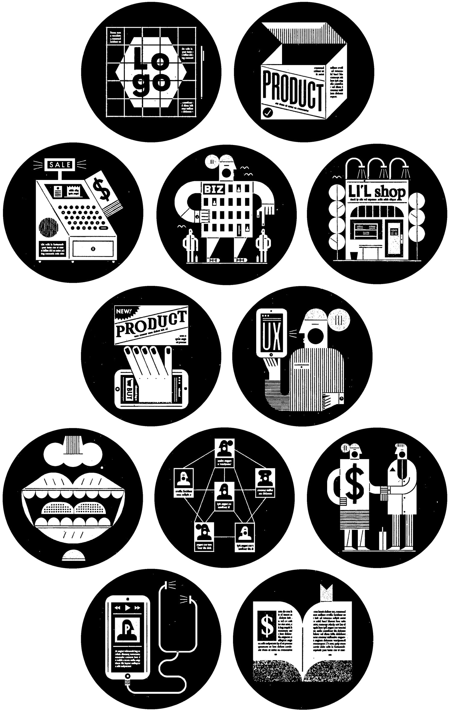
18.
I have a long history of making (and enjoying making) small black and white icons that represent distinct ideas. Back in 2007 the Seattle Stranger had me make a dozen 1" circular section-front icons; they remained in print 'til the magazine went digital in 2022. This set? Made for Entrepreneur magazine's Dec. 2017 issue, expressing 13 modern business points. They show e-commerce, UX, retail, workplace, marketing, social media, fundraising, recruiting, package design, podcasting, small business, storytelling, and branding. Art direction by Paul Scirecalabrisotto.
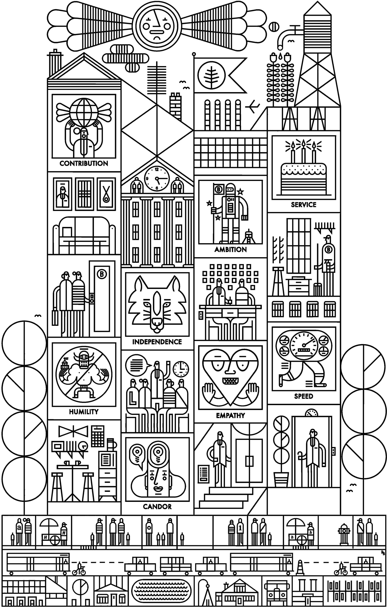
19.
The future might be OK for illustrators who can draw complex ideas for tech companies. Breather is a 200-or-so employee biz from Montréal that's almost like an Airbnb for commercial space. They hired me to make an edition of 24x36" silkscreened prints reflecting their diverse architectural holdings and the eight values held dear by the staff. What I came up with shows an enormous mixed-style building with living spaces, hallways, stairwells, elevators, Breather spaces, and eight rooms representing the aforementioned values. Each of the “value” rooms can be removed and printed as standalone smaller pieces.
20.
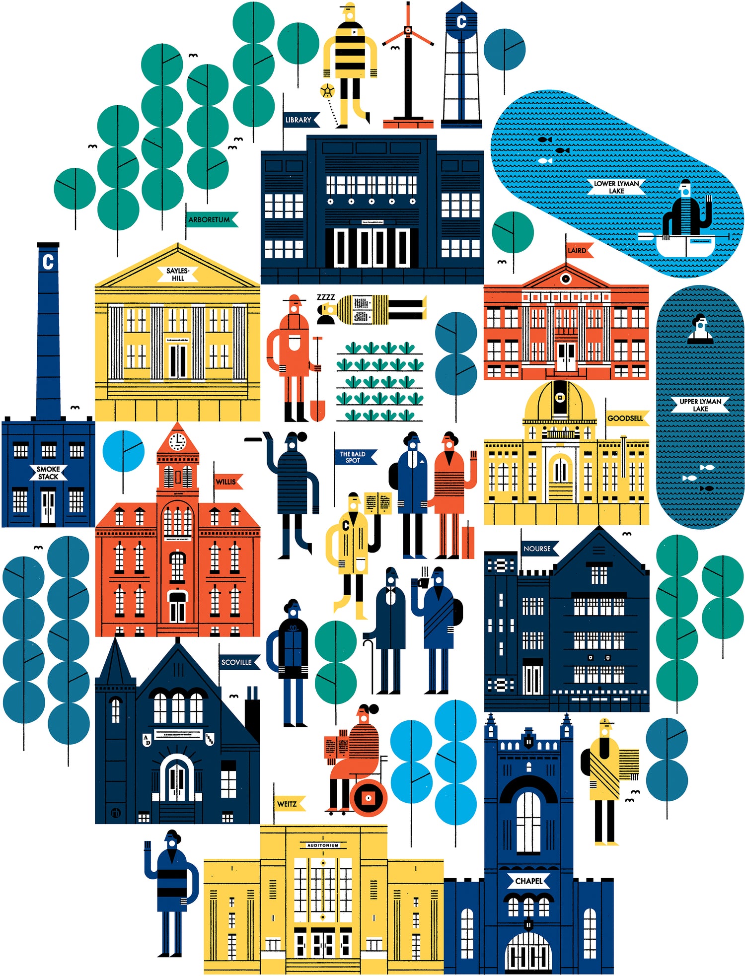
Maybe you’ve noticed that I’m into architecture? Well, so did Carleton College in Northfield, Minnesota. Their wonderful communications and design people commissioned this pictorial map for an oversized poster showing prospective students the merits and originality of their tidy, charming campus. They liked it so much that they have since commissioned a sticker series and some postcards highlighting top instructors and campus traditions.

21.
Markus Hillborg is one of my fave ADs, and here he had me make a cover for the in-flight magazine of Swedish air carrier BRA. The subject? The slowly (but steadily) developing theories and practices behind environmentally-friendly flying. Included in the mix: biofuels, lightweight materials, electric power, computer-generated flight paths, reduced flight frequencies, etc.
22.
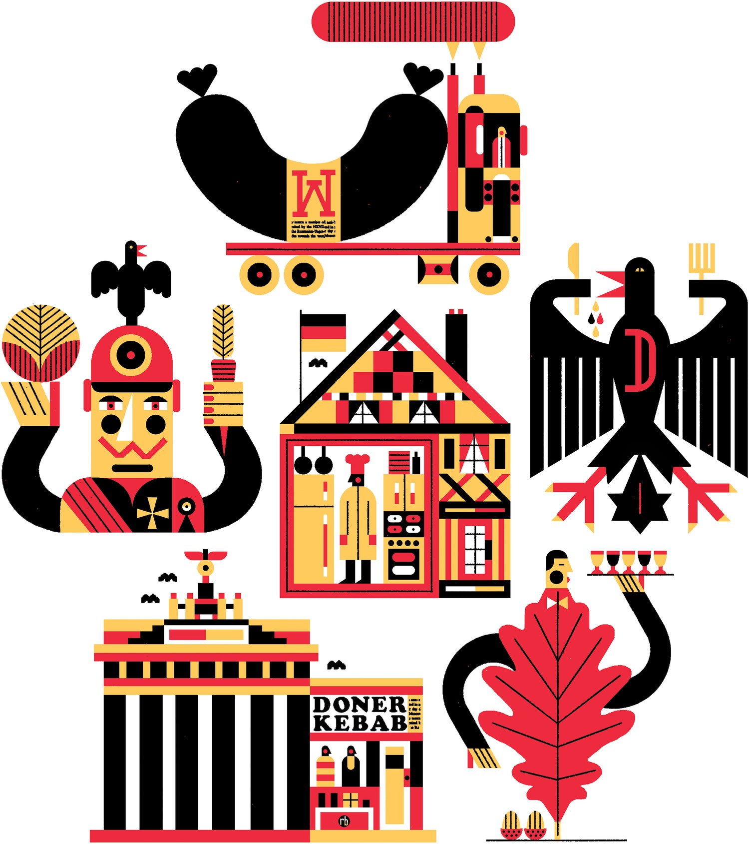
You’re in Germany and wondering “is that a bratwurst driving by?” You’re hungry, but not hungry enough to eat at that kebab stand. You’re more interested in home cooking, but it’d be rude to barge into a random chef’s house. You blink and find yourself near an oak tree. It sprouts limbs and a bow tie. It gives you a drink. Hallucinations follow. Is that Kaiser Wilhelm brandishing a carrot and cabbage? He welcomes you warmly, shows you a new version of his nation’s coat of arms, and reminds you you’re in a set of illustrations published in Bloomberg Pursuits “What to Eat in Berlin” feature in 2015.

23.
It ’s always a pleasure to stretch out and make tall illustrations in print, and this gentleman stood about 20" tall in the 25 June 2014 issue of the Washington Post. With and within him: urban gardens, bikes, lemonade, the Anacostia River, pleasant stairwells, the Smithsonian Museum, bike lanes, pedestrian lanes, specific houses, green spaces, a Metrobus, swing set, fresh fruit, a farmer’s market and a chipper little dog. Special thanks to Weekend Art Director Chris Barber for getting me in on this.
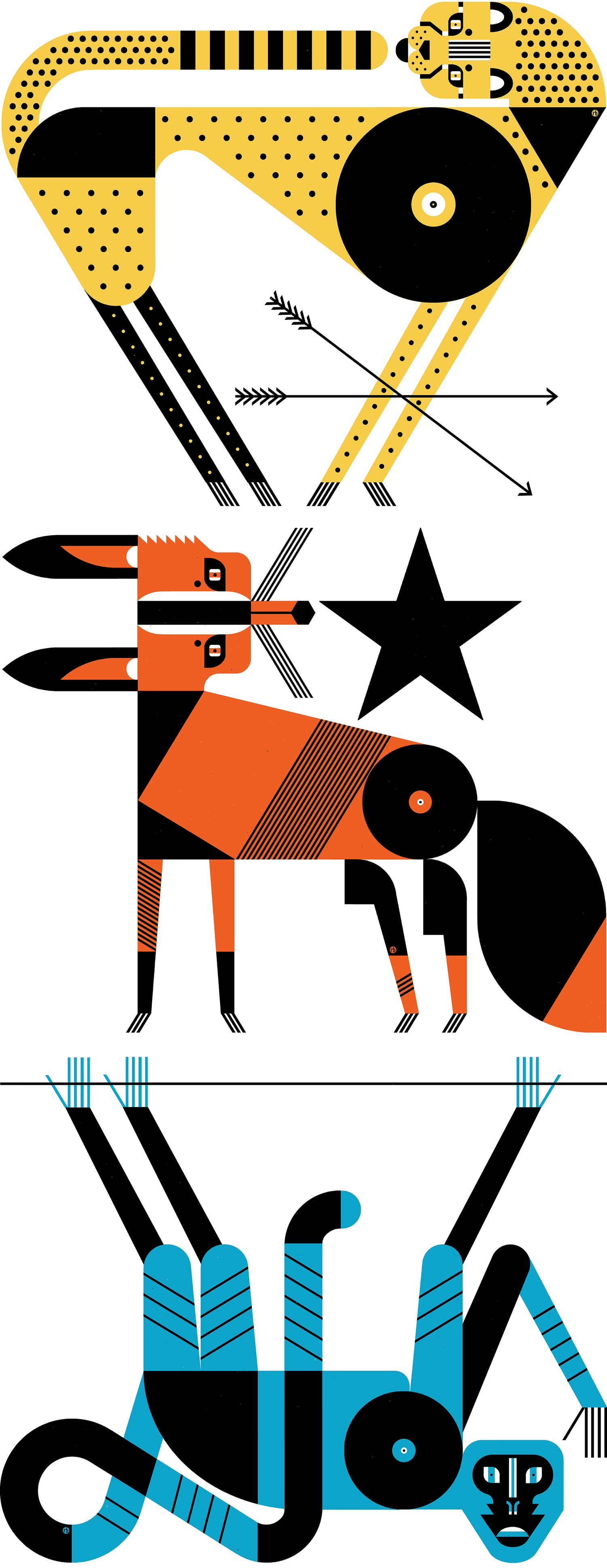
24.
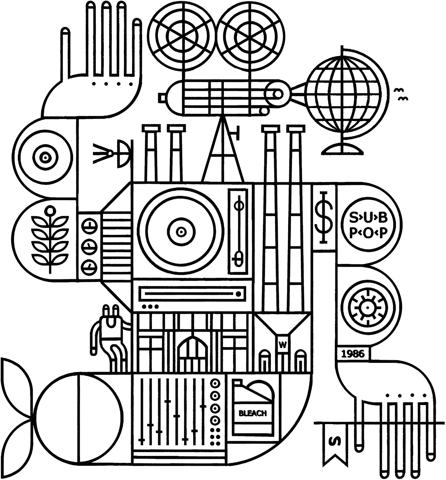
Into symbolic analysis? Then I have the illustration for you. Drawn in January of 2013 for Sub Pop Records, this spent a good two and a half years waiting on ice until their miscellaneous-merch-based doomsday device (aka the Sub Pop Mega Mart) was deployed and this found its way on to a line of shirts. Through it you’ll find Sub Pop’s founders, a turntable, Sub Pop HQ, a Singles Club single, Nirvana references, cassette spindle, and aspirational world domination propaganda.